EnergyAustralia
Creating the first design system for one of Australia's top energy gentailers
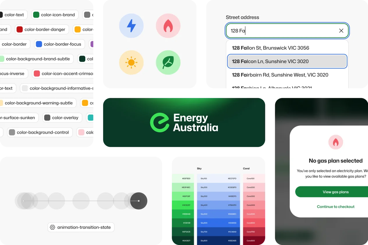
With dozens of customer and internal-facing applications, each with their own design patterns and front-end frameworks, EnergyAustralia faced a growing problem of inconsistent design and lack of standards across their entire digital ecosystem.
Designers embedded in product teams worked in silos with no shared design language or consistent process, while developers had no standards to adhere to. The costs were significant, with slow delivery, inconsistent user experiences, accessibility failures and duplicate development effort all piling onto a mountain of design and technical debt accumulated over decades of incremental technological evolution.
As technology teams pivoted towards a universal React front-end framework infrastructure, the time was right to create the company's first digital design system. Leading both strategy and delivery, a rich, scalable system was curated to establish a shared design language, clear standards and enforce governance.
Ecosystem & workflow
Before pushing a single pixel, the design system was seeded by first examining how it would function within a diverse digital ecosystem, in order to tackle one main challenge: changing how an entire organisation designs and builds digital products. Many areas of the business were consulted, from technology and product teams to marketing and legal, to identify how the system could address their unique concerns.
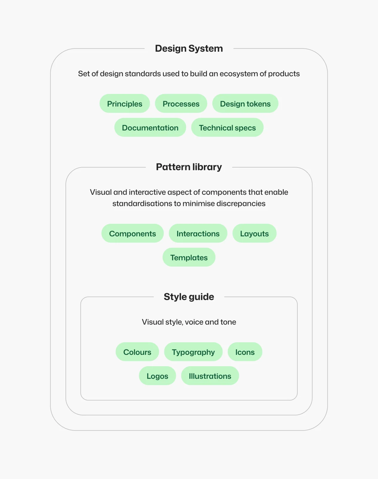
Utilising atomic methodology, the system was carefully structured around the existing product suite, their core requirements and how a multi-tier workflow would benefit the creation and maintenance of both the design system and its dependent products.
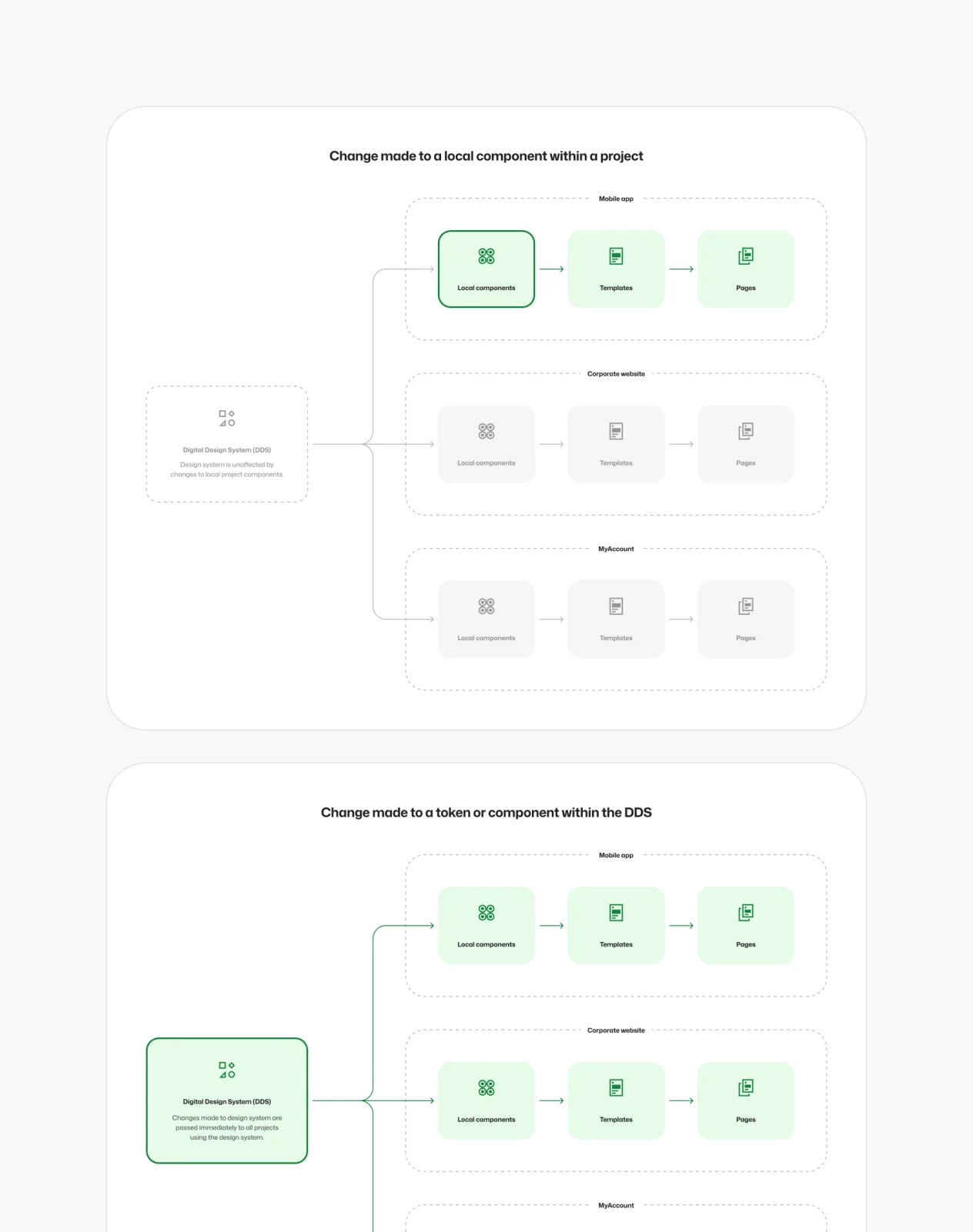
The existing digital experiences ranged from customer-facing websites, web apps and mobile apps to embedded mini-apps such as forms, calculators and quotation tools, and even internal-facing digital tools. The design system needed to be extensive yet flexible enough to allow designers to create intuitive, consistent, accessible and on-brand experiences underpinned by a technical implementation that encouraged simplicity and reusability of repeated micro-experiences via mini-apps or local component sharing.
The technical architecture was a critical consideration too, with the design system’s structure set up to complement the React framework and workflow. Clear rules were established around governance, conformance and minimum standards, which determined what lives inside the design system and what doesn’t, what criteria must be met for a change request, and how such changes will be managed and rolled out to the local product layer. All of this would be governed by the UX team using a design-first methodology to ensure the integrity of the system would not be adversely impacted as it scaled, or slowly bloat from too many ad hoc contributions.
Foundations
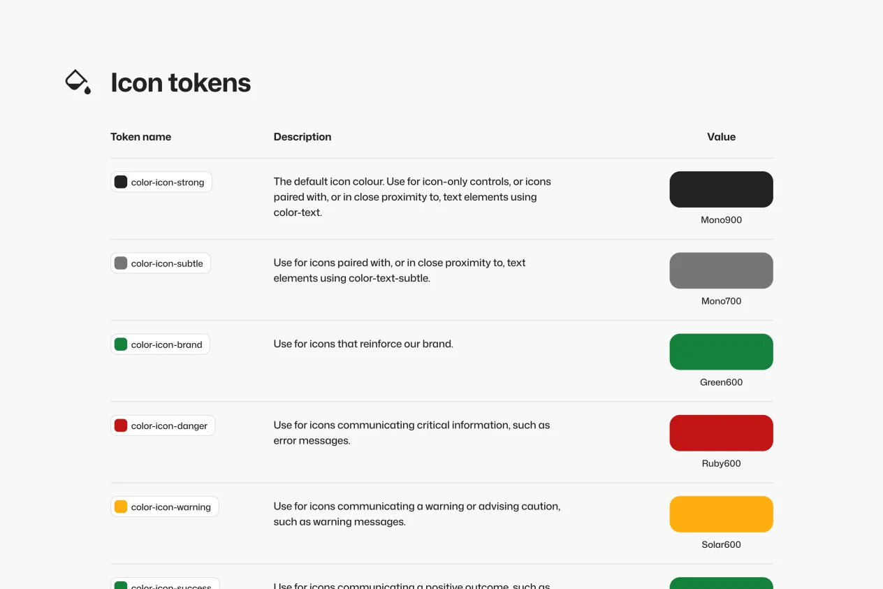
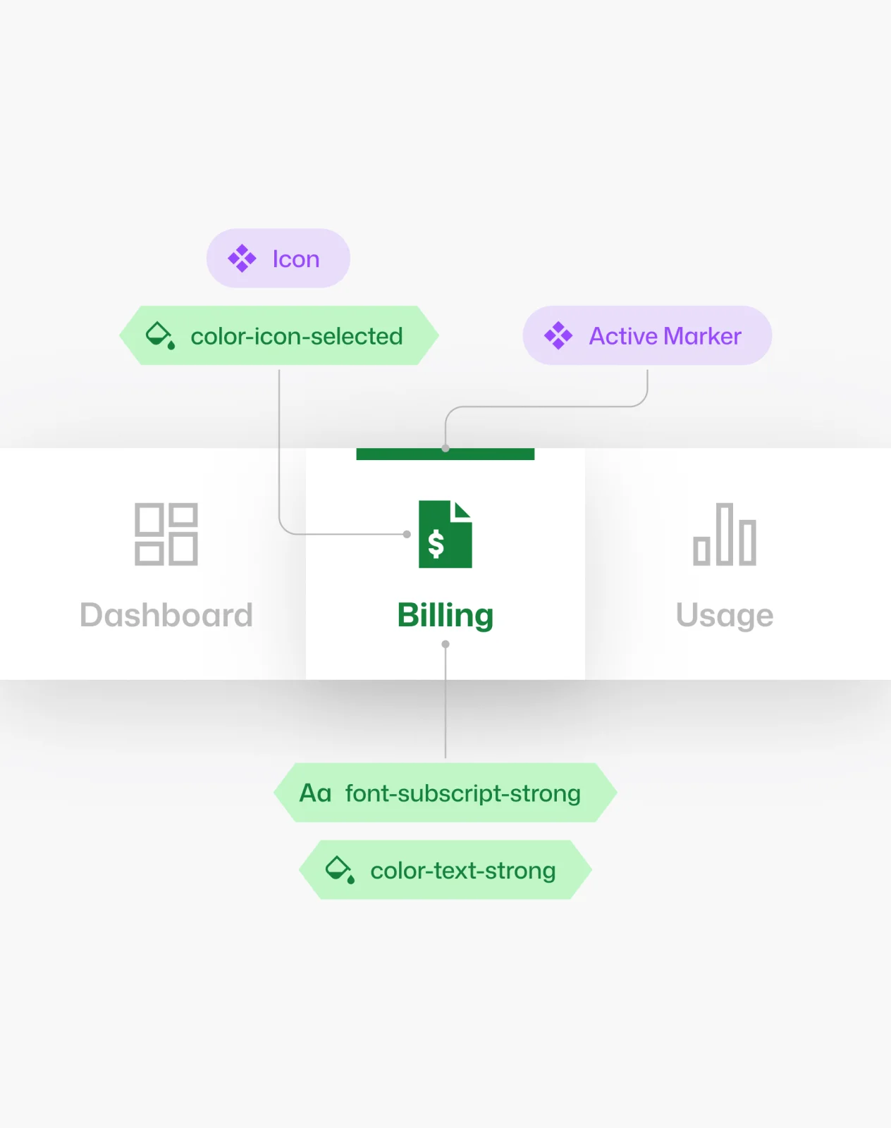
As design commenced, the foundations were thoughtfully laid for the simplest, most primitive parts of the UI design language. With scalability and flexibility front of mind, a robust set of design tokens was meticulously laid out and stress-tested. Every atomic design element that could be meaningfully tokenised was. Naming conventions, categorisation, aliasing rules and how each token would be exported and parsed into code were all given careful consideration.
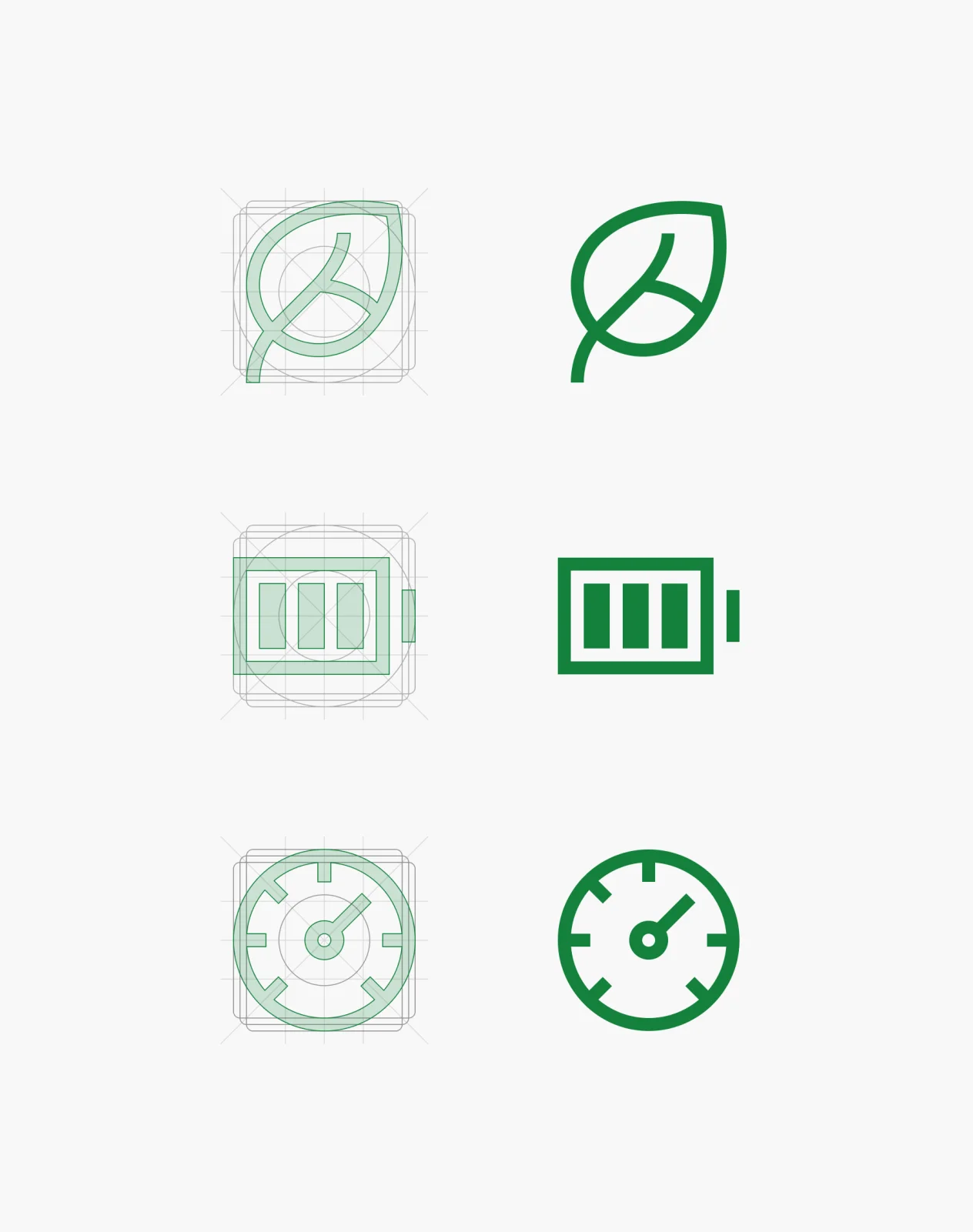
The result was 313 design tokens covering colour, typography, elevation, shape, space, size and animation, accompanied by a suite of primitive components including 500+ hand-drawn icons and pictograms.
Components
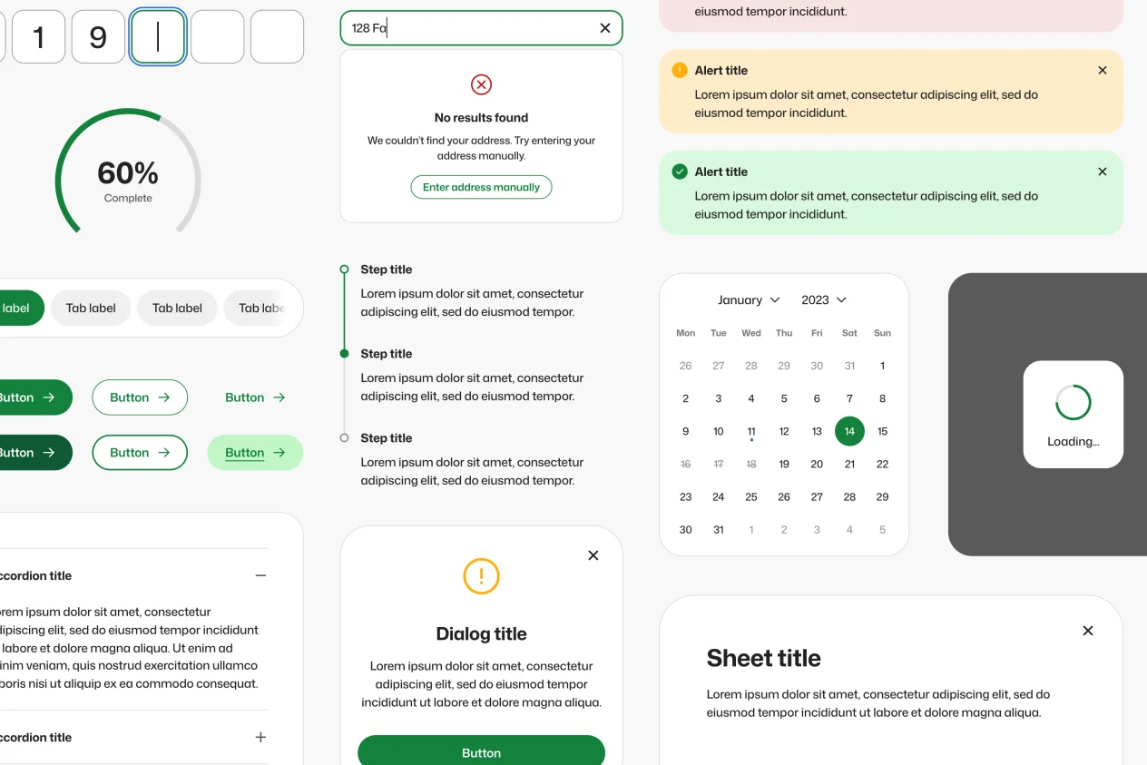
With the foundations in place, the full suite of components was created and fleshed out by stress-testing each within real in-flight design projects to ensure each component and its variations were fit for purpose while striking the right balance of flexibility and purposeful constraints.
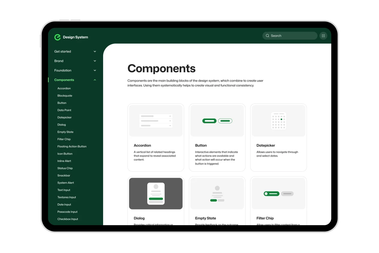
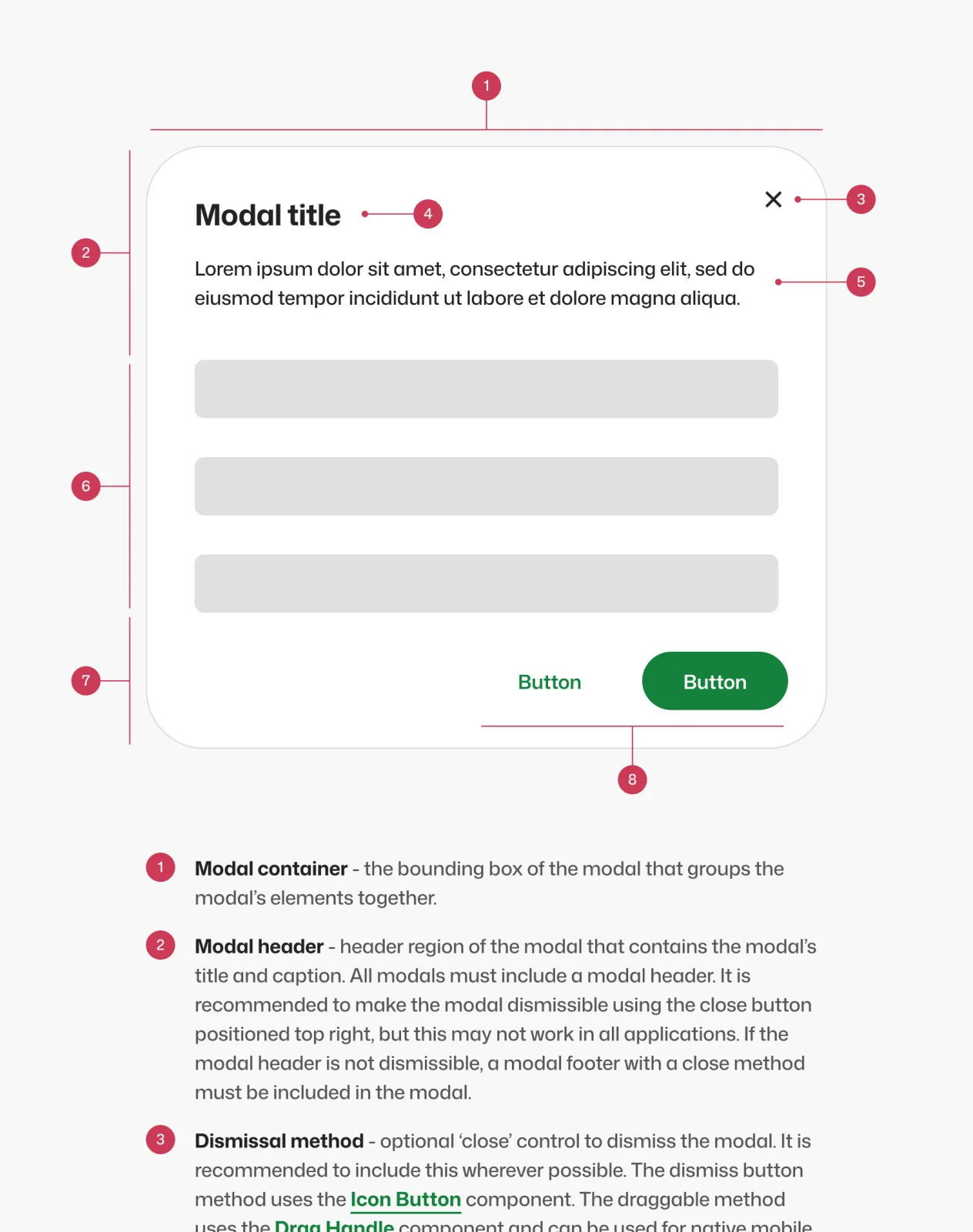
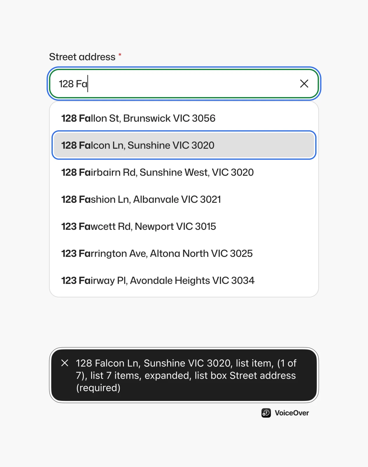
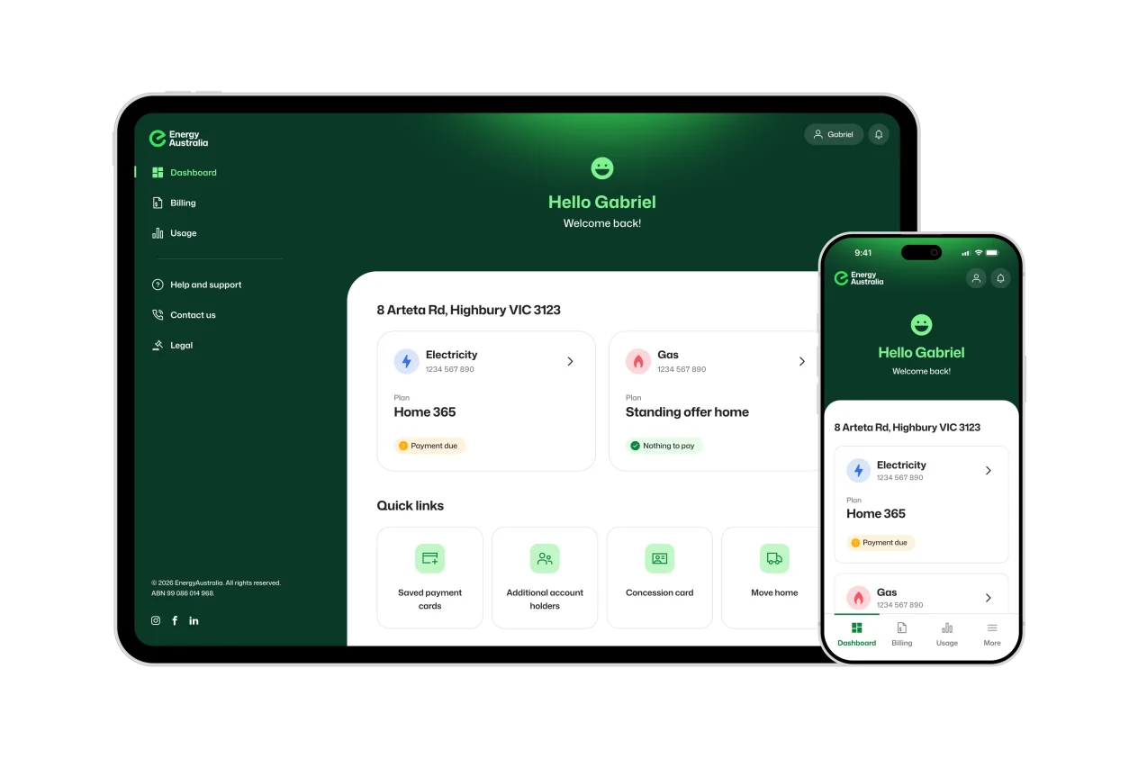
The first version of the design system housed 80+ components, ranging from stock-standard buttons and alerts to bespoke components such as address inputs and pricing rate tables, created to cater for the business’ unique operational needs and common customer experience touchpoints.
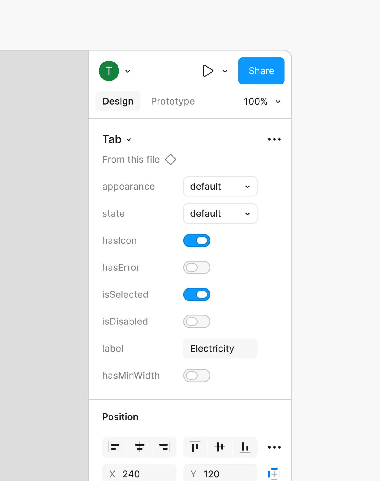
Each component was systematically dissected and constructed for the practical daily needs of designers within their design tools, and to translate meaningfully into the React codebase. Aspects such as component props were carefully conceived to ensure a like-for-like representation in both design and development, significantly improving handover and first-pass development accuracy as projects began using the design system in practice.
The components were created collaboratively through sessions with designers and engineers, providing both with a sense of ownership, which significantly improved later adoption.
Accessibility & tech specs
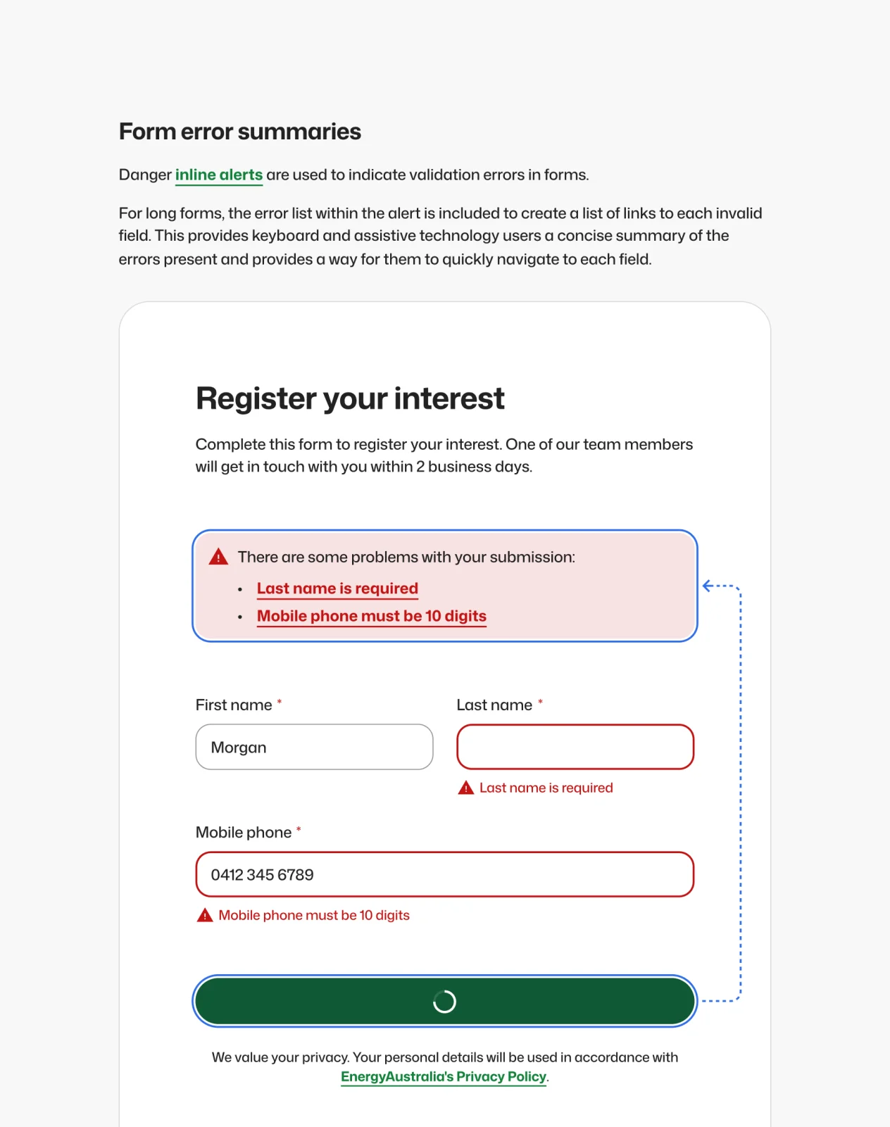
While retailers (at the time) were not explicitly required to meet WCAG standards under legislation, as a tier-one retailer, treating accessibility as an afterthought would have been a costly mistake. Making the design system WCAG 2.2 level AA compliant by default was desirable in order to make the products accessible to all customers, minimise the risk of future compliance or legislation breaches, and help eliminate back-office enquiries caused by barriers in the digital space.
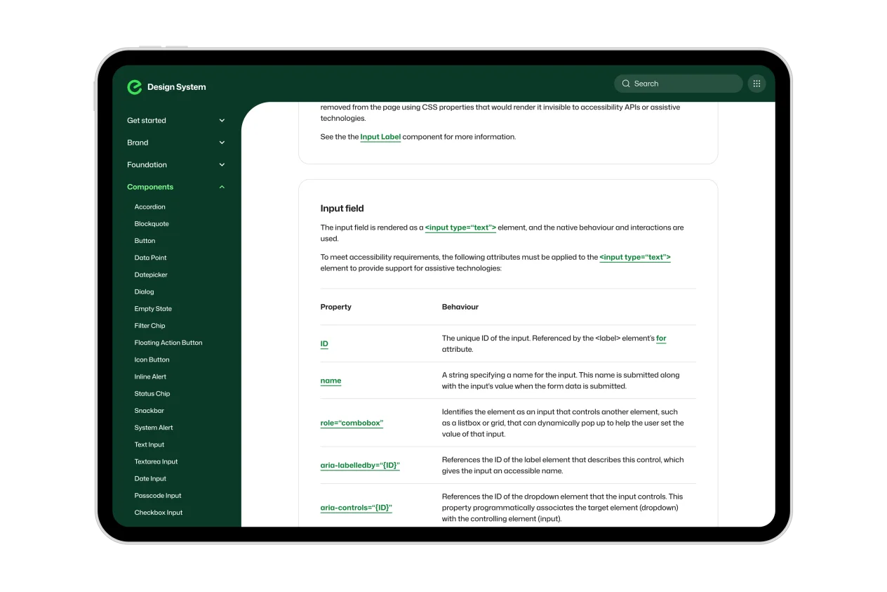
Additionally, to minimise guesswork and cover gaps in individual product teams’ knowledge, it was important that the design system handle as much of the technical accessibility requirements as feasible. Designers could move quickly and confidently, knowing that every contrast ratio had already been checked, while developers didn’t need to spend time tinkering with semantics or experimenting with complex interactions for assistive technologies; the components were robust enough to simply require core parameters to be defined, and they handled the rest.
Each component was meticulously documented and tested. If a technical trade-off required a change to the design itself, those decisions were equally important, and designers were heavily involved in ensuring visuals never compromised accessibility.
The results? Product teams were able to achieve WCAG compliance significantly faster, with more than 80% of accessibility requirements already catered for just by using the design system correctly and adhering to the guidelines, leaving them ample time to address gaps at the product level.
Scalability & governance
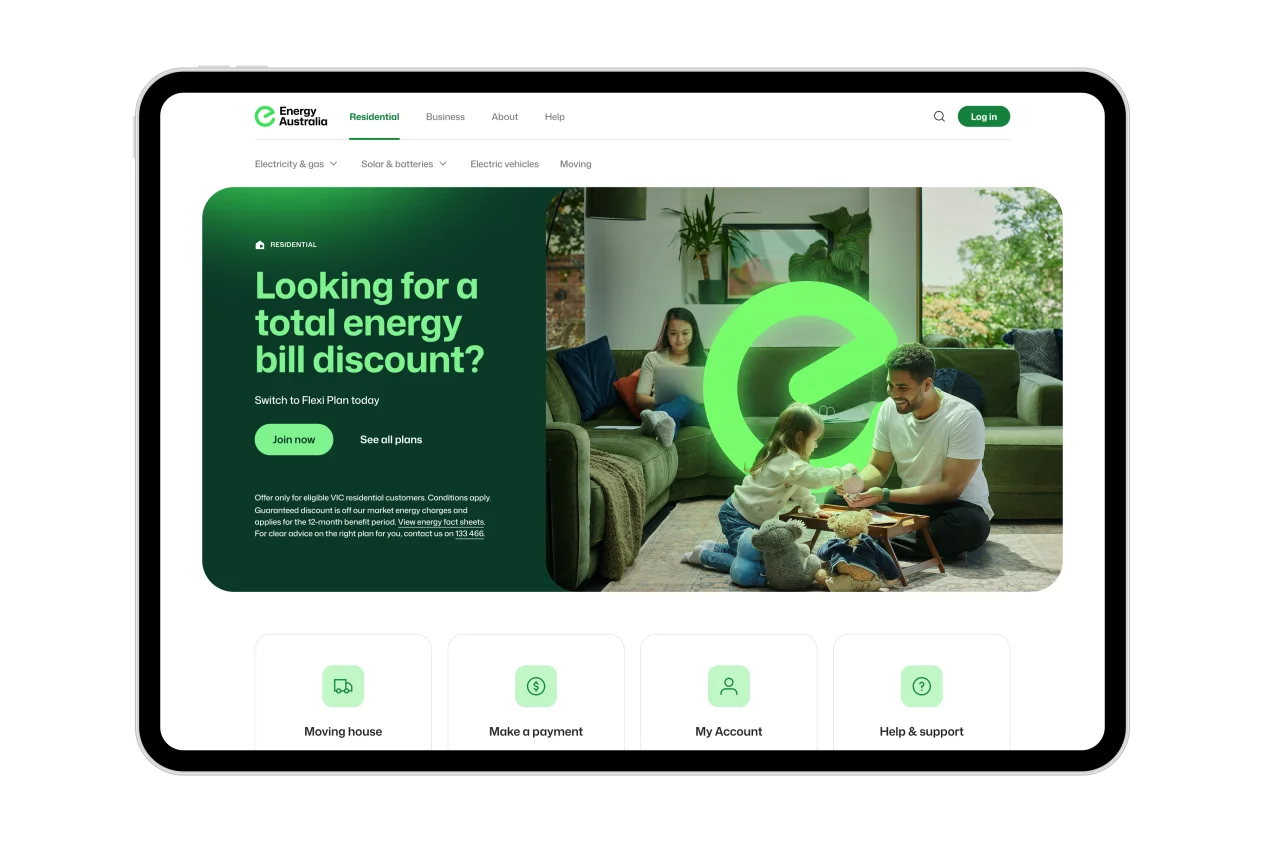
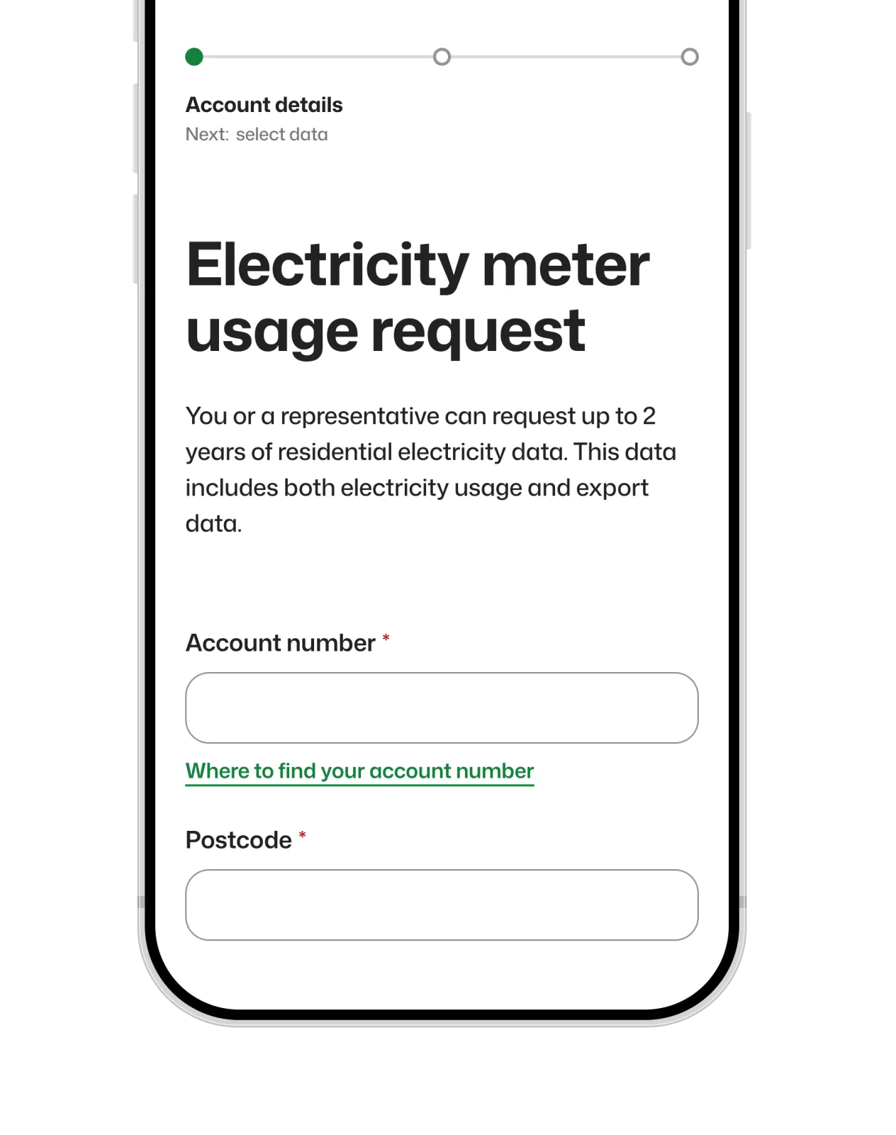
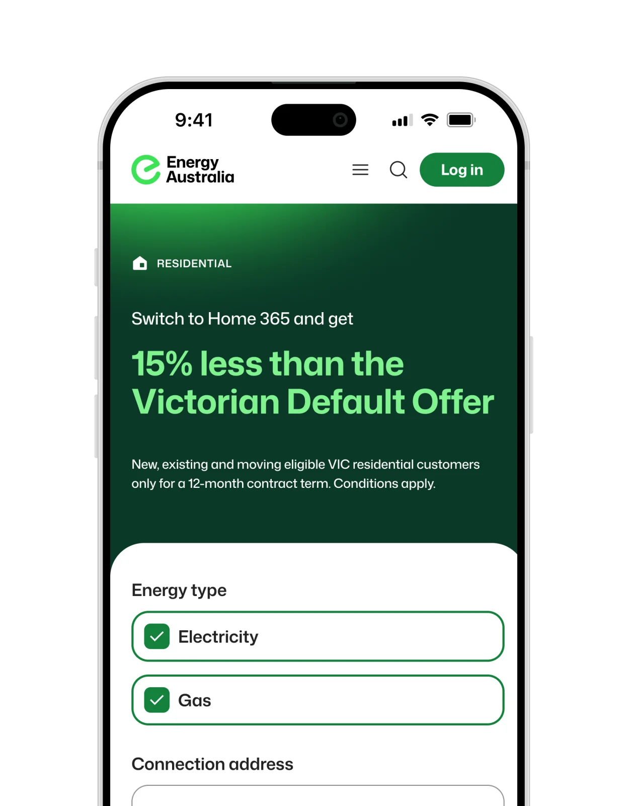
Due to the scale of the digital ecosystem, adoption of the design system needed to be phased. New products or initiatives use the system by default, while legacy work is continuing to be incrementally uplifted.
As adoption ramped up, the system was continually refined. Everything from bug fixes to requests for new features or components were catered for, all carefully governed by the UX team to uphold the established standards.
Product teams continue to report significantly faster delivery when using the design system, particularly with regard to accessibility. Other teams have also praised the system for providing a clear standard and direction for digital design within the business, providing a core anchor for the evolution of peripheral concerns such as brand design and content production.
As adoption of the system continues to scale, digital experiences are becoming noticeably more consistent, on-brand and polished, with beneficial impacts on conversion and retention.